Optimize your pictures for best display within new Twitter image previews
Twitter has updated it’s various feeds (on the web, and in its mobile and desktop apps) to allow for displaying a partial preview of images. While the value of this is being debated by some, this particular article is aimed at folks who wish to take advantage of this new feature by optimizing the initial preview of their inline images.
Twitter inline images display as a landscape-oriented ‘preview’ of your attached picture right in the main feed, regardless of whether or not your full size image is in a landscape or portrait orientation. If you tap or click on an image, it ‘opens’ for viewing at full size. Twitter has confirmed that they are using a simple 2:1 fixed ratio to create uniform sized previews:
Tip: If you want your entire image to be visible in the Tweet preview, use a horizontal image w/ a 2:1 aspect ratio (e.g. 1024 X 512 pixels)
https://twitter.com/TwitterSmallBiz/status/403915826928967680
— Twitter Small Biz (@TwitterSmallBiz) November 22, 2013
While they have shared the above details, I’ve yet to track down specifics regarding the vertical positioning of cropped images and if they are simply centered, or if their position is random. Test on various devices, so far, seem to point more to a random Y-axis positioning.
What does this mean for savvy Twitter marketers?
Well, if your followers are going to see these images, you may wish to control what appears within the initial preview area. If your goal is to present a coherent message right in the preview, without requiring a user to ‘open’ it to full view, you can simply produce horizontal artwork at the fixed 2:1 landscape ratio. This will ensure that any text copy, or significant aspects of your image, will appear immediately – and not get cropped out of view in the preview. Don’t assume that people will tap on your image preview to see the entire thing – if you have a written message to communicate, you are best off using a fixed-size picture at this ratio.
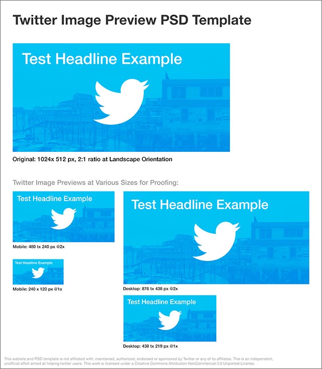
To help design an exact size image or layout, I’ve created a PSD template with a smart object at 1024×512 (proof shown above, not at actual size). Make sure you have the Layer Comps window open. Double-click to open the “EDIT ME…” layer, and design your master artwork in this smart object. Then close and save the smart object file to immediately see a preview of how your image will look at various sizes on different devices. When your final image is ready, simply use the “File/Save for Web…” feature and it will create a PNG of your final 1024×512 image.
The goal is to help you craft a design that will display OK in all situations (screen sizes). For example, don’t put too much text in general and watch your font sizes for readability. If you don’t have Photoshop, just make sure to use a 2:1 ratio. Let me know if you have any other suggestions.
- Download the Twitter Image Preview PSD template
- Download the Twitter Image Preview PSD template (compressed as .zip)